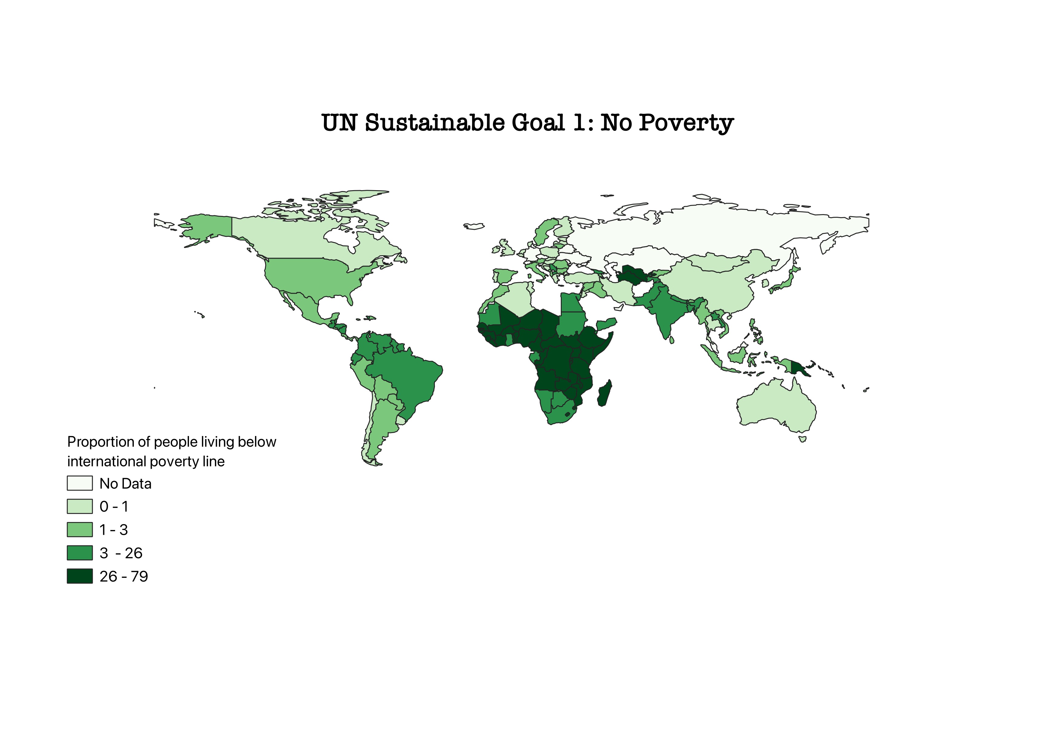
In Choropleth maps statistical data is represented through varying shades or colors applied to different regions such as countries. The strength of this maps is that itʼs very intuitive to understand what is represented just by refering the legend of this map. The data that I particularly chose represents the proportion of the population living below the international poverty line by sex, age, employment status and geographic location (urban/rural). I picked the SDG indicator 1, which aims to reduce poverty in the world. I picked this indicator as I thought, everyone has an general outlook on richer and porer countries but it is much more interesting to represent this on a map as it helps solidify our understanding of the global economy and therofore allows us to effectively tackle inequality.
